15 Conversion Optimization Tips that Compound (2026 Playbook)
Last updated:
ShortPen University


LucaG is the co-founder of ShortPen. Before that, he built Guadagnissimo from scratch, a personal finance blog that reached hundreds of thousands of readers per year and was later acquired. That experience is where he learned SEO and marketing attribution hands-on. He also runs NTSOT, a newsletter on tools for work and life. His background spans product design, growth, and building online businesses.
Show more
15 Conversion Optimization Tips that Compound (2026 Playbook)
Most websites convert between 2% and 5% of visitors. Statista puts the global blended average at 1.7%. The math is brutal either way: 95 to 98 of every 100 people who reach your site leave without doing the thing you built it for.
That is not a traffic problem. It is a conversion problem. And most conversion optimization tips you will read this year cannot fix it, because they are written as 50-tactic dumps with no diagnostic frame. The reader walks away with options, not direction.
The conversion optimization tips in this guide are based on best practices and proven conversion rate optimization strategies for online businesses.
This playbook is structured differently. The 15 tips below sit in four clusters: page-level plays, traffic-level plays, methodology, and trust psychology.
Each one ties to a real test or data point, and each addresses a lever you can move this quarter. You also get the link-layer plays most CRO articles skip: post-click event tracking, channel-level attribution, and how to route different traffic sources to the right page.
A move from 2% to 3% is a 50% increase in revenue with the same traffic. AudioEye reports that for every $92 spent on customer acquisition, just $1 goes to conversion optimization. The teams that flip even part of that ratio compound their gains.
What counts as a good conversion rate
Industry benchmarks (and why they mislead)
The averages are easy to find and almost useless on their own.
Ecommerce sites typically convert at 1% to 4%.
SaaS free-trial and demo signups land between 3% and 7%.
B2B lead-gen runs 2% to 5%.
Finance and insurance sit at 5% to 10%.
Landing pages average 2.35% across industries, with the top quartile converting at 5.31% and the top decile hitting 11.45%.
Those numbers do not tell you what to optimize. A 1% conversion rate on a $500 product means something different from a 1% rate on a $10 item. Traffic source matters. Device matters. Funnel stage matters. Pooled benchmarks hide all of it.
The only benchmark that matters is your own
Compare your site against itself. A move from 1.8% to 3% is 66% more revenue from the same ad spend. That is a real outcome. Beating an industry average is a vanity metric.
Track macro conversions (purchases, paid signups, demo requests) and micro conversions (cart adds, video watches, pricing page clicks) together.
Micro conversions predict macro behavior, and they show you where the funnel breaks before the final step.
Remember, conversion rate optimization is an ongoing process that requires regular tracking, testing, and refinement to achieve lasting improvements.
Page-level conversion optimization tips
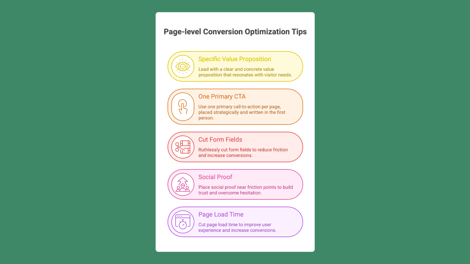
Tip 1: Lead with a specific value proposition
Eight out of ten visitors read your headline. Two out of ten read the rest. The headline carries most of the conversion weight on any page, and most headlines waste it on vague claims.
"Faster checkout" is forgettable. "Checkout in under 60 seconds, no account required" is not. The headline should mirror what the visitor is trying to do, with a concrete outcome, number, or time frame. If your homepage headline could apply to any company in your category, rewrite it.
Tip 2: One primary CTA per page, in the first person
The single biggest CTA mistake is putting one on every screen and hoping. Conversion-aware pages run one primary call-to-action per view, placed after the visitor has enough context to act, with secondary CTAs only after the full pitch.
The copy detail matters more than people expect. ContentVerve ran a test where Unbounce changed its CTA from "Start your free 30-day trial" to "Start my free 30-day trial." Click-through rose 90%. One word. Going doubled trial conversions month-over-month by testing CTA copy alone. Campaign Monitor saw a 127% improvement using personalized CTAs.
The pattern: benefit-led, first-person language wins. "Get my pricing & timeline" outperforms "Submit." On long pages or product detail pages, add a sticky mobile CTA so the action is always one tap away.
Tip 3: Cut form fields ruthlessly
Every field in a form is a potential exit point. HubSpot research found that reducing a form from four fields to three increased conversions by 50%. Baymard Institute data show that the average ecommerce checkout has 11.8 fields, while most checkouts only need around eight.
A separate Baymard finding worth sitting with: 66% of Cabela's customers abandoned the payment form when overwhelmed by optional promotional fields. Visible promo-code fields trigger "coupon hunting." Visitors leave the page to find a discount and never come back. Collapse promo fields by default. Most sites do not.
Beyond field count, form mechanics matter: forms should be user-friendly, with intuitive design and accessible features to enhance user experience and increase conversions. Enable autofill, use real-time validation, and allow guest checkout. Forcing account creation before purchase is one of the highest-friction decisions a site can make.
Tip 4: Place social proof near the friction points
Trust is the silent killer of conversions. Baymard data shows that 17% of cart abandonments happen because users do not trust the site enough to enter payment details. That is not a pricing problem or a product problem. It is a trust gap.
Specific social proof beats generic. "183% increase in demo conversions" outperforms "great tool for marketers." A named customer with a job title outperforms an anonymous quote. Place reviews, testimonials, and customer logos near the CTA and near checkout, wherever hesitation peaks.
Lucky Orange's case with Interplay Learning is one example: hiding visible pricing on the pricing page, paired with stronger social proof, lifted demo conversions from 6% to 17%, a 183% jump.
Tip 5: Cut page load time
Page speed is a revenue input, not a technical preference. Google's research shows that as load time goes from 1 second to 3 seconds, mobile bounce probability rises 32%. From 1 to 5 seconds, it jumps 90%.
Portent's industry data found that a site loading in 1 second converts roughly 3x better than one loading in 5 seconds.
The fixes are unglamorous but reliable: compress images and serve them in modern formats, minimize JavaScript execution, enable browser caching, and use a CDN.
Run your homepage and top landing pages through Google PageSpeed Insights. Fix Core Web Vitals (LCP, INP, CLS) before you test anything else.
Traffic-level conversion optimization tips
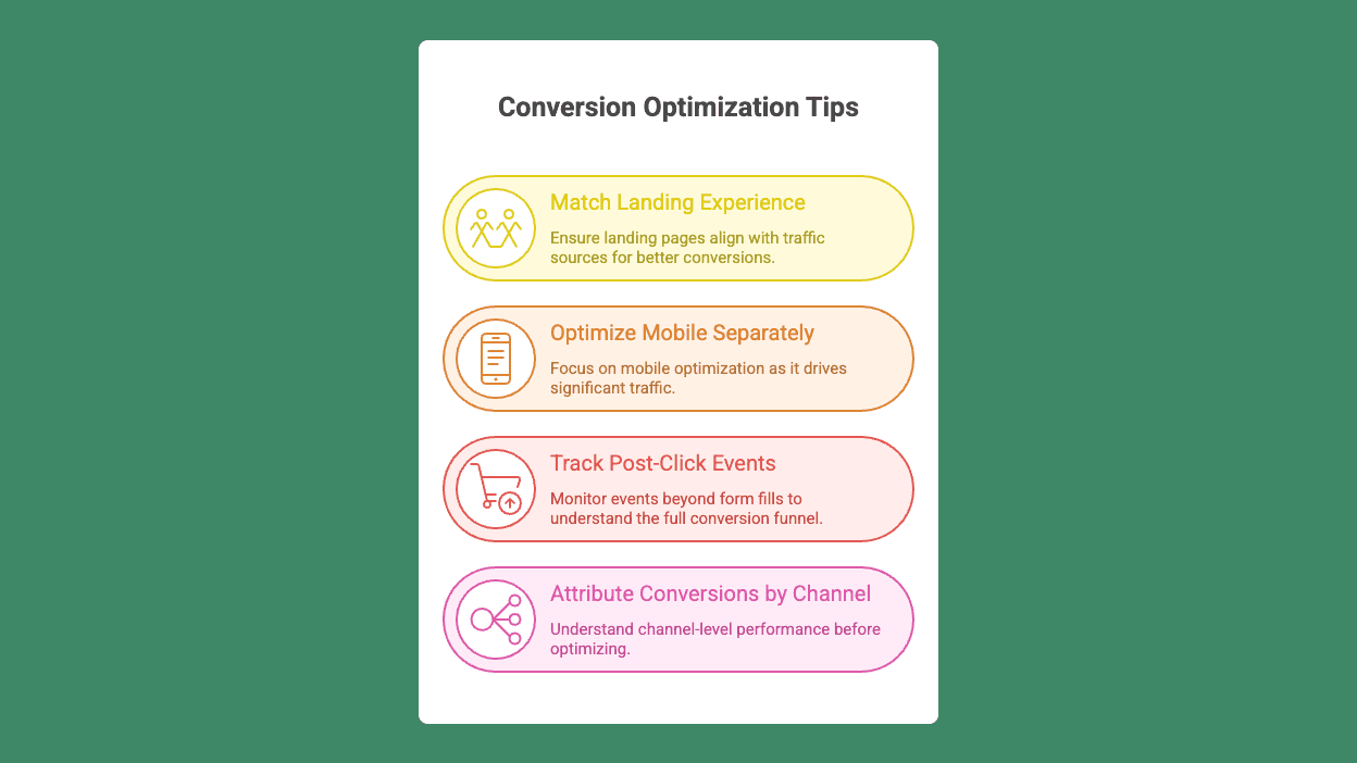
Tip 6: Match the landing experience to the traffic source
Generic landing pages flatten conversion across every channel they touch. A visitor coming from a paid search ad for "Shopify analytics" expects something different from a visitor arriving from a blog post about retention. Same product, different promise, different page.
The principle is message match: the landing page should mirror the ad's promise. Emotion, then proof, then offer, then action. The page either confirms the click or contradicts it.
To attract as many leads and sales as possible, design landing pages that provide a positive and seamless user experience tailored to each audience.
Most CRO articles assume one canonical landing page for the whole site. In practice, you need a way to route different sources to different landing experiences and measure each separately.
ShortPen gives each campaign its own branded short link on your custom domain, tagged with consistent UTM parameters, so you can route different ad creatives or email segments to different landing variants.
The link layer becomes routing infrastructure: you split-test entire pages per traffic source, and analytics for each link stay separate.
Tip 7: Optimize mobile separately, not as an afterthought
Mobile accounts for over 60% of global web traffic. Most CRO work still happens on desktop. That mismatch is where conversions die.
Desktop and mobile visitors behave differently. Pooling them together masks what is actually happening on each device. Run your conversion tests on mobile traffic separately, and you will often discover that a "no significant lift" overall result was a clear win on one device and a clear loss on the other.
Mobile-specific killers: tap targets too small for thumbs, full-screen popups, checkout flows that assume a keyboard, and slow load on cellular connections. Use sticky CTAs on long mobile pages. Test guest checkout specifically on mobile, where typing fatigue spikes abandonment.
Tip 8: Track post-click events, not just form fills
Most CRO articles say "track conversions" without explaining how. Form-fill tracking misses the actual moments of value: a signup completed three pages later, a purchase confirmed at checkout, a demo booked from a thank-you page.
Tracking post-click events is essential for understanding and optimizing the entire conversion funnel. The mechanic is straightforward in principle: install a tracking pixel on your site, then define events for each conversion type and tie them back to the link the visitor clicked.
Without post-click events, your A/B test "winners" can hide downstream conversion losses. You ship a variant that lifts CTA clicks 20% and silently drops paid signups by 5%.
ShortPen handles this without engineering involvement. You install the ShortPen Pixel once, then create events from the dashboard: URL-triggered (fires when a visitor reaches a page) or code-triggered (fires when your app confirms an action).
Each event ties back to the originating link, so clicks, scans, and conversion rate per event sit in the same view. Click data shows who engaged. Pixel data shows who converted.
Tip 9: Attribute conversions by channel before optimizing
Site-level conversion rates hide channel-level reality. A site converting at 3% blended might convert at 0.5% from email and 5% from paid search. Optimizing the page before you understand which channel is broken is wasted work.
Tag every campaign link with consistent UTM parameters: source, medium, campaign, and content.
Look at the conversion rate per channel before deciding what to test.
If email converts at a tenth of paid, the problem is probably the email funnel, not the landing page. If paid social converts well below paid search, the issue is likely a creative-to-page mismatch on social, not the page itself.
ShortPen's link-level analytics make this visible: every link shows clicks, scans, conversions per event, and conversion rate, plus breakdowns by source, country, device, browser, and language. Workspace-level analytics segment by folder or tag to compare campaigns across channels in one view.
Methodology: make wins compound
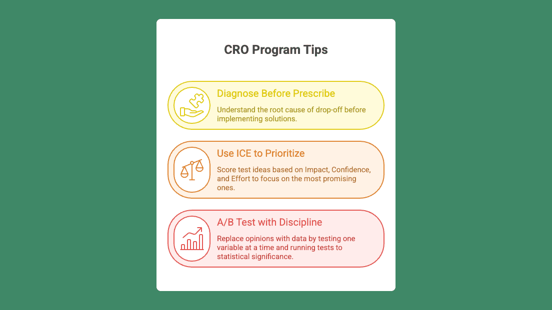
Tip 10: Diagnose before you prescribe
Drop-off is a symptom. The cause is usually one of: unclear value, unaddressed doubt, trust gap, friction point, or mismatch between traffic intent and landing experience. The single biggest mistake CRO programs make is prescribing tactics before diagnosing where the decision actually breaks.
A workable diagnostic frame, adapted from CRO Digital Marketing's approach, has three jobs:
Diagnose where the decision breaks, not just where drop-off happens. Drop-off is the symptom, the decision is the cause.
Translate behavior into prioritized fixes: what belief needs to change, what friction needs removing, what reassurance is missing.
Build a conversion system, not a one-off audit. The site, the ads, the offers, and the customer expectations all evolve.
In practice: use heatmaps and session recordings to see where attention dies. Use surveys (especially exit-intent and post-purchase) to learn why. A single question, "What almost stopped you from signing up?", will surface objections no amount of analytics will show you.
Tip 11: Use ICE to prioritize what to test
You will always have more test ideas than capacity. The ICE framework is the simplest filter that works: score each idea on Impact (how much will this move the metric?), Confidence (how sure are we it will work?), and Effort (how much work to ship and analyze?).
High-impact, high-confidence, low-effort wins ship first. Low-impact tests get dropped no matter how easy they are.
Before launching any test, run a five-question check: Is the traffic qualified? Is there a clear hypothesis? Is there enough volume to reach significance? Is this page in the critical path? Have you talked to users about it? If you cannot answer yes to all five, the test is not ready.
Tip 12: A/B test with discipline, not vibes
A/B testing replaces opinion with data when run correctly. It generates noise when it is not.
Test one variable at a time so you can attribute the result. Set your Minimum Detectable Effect (MDE) before launching: the smallest lift the test needs to detect to be worth running. Run to statistical significance.
Stopping early because the numbers look good is the most common testing failure, and it leads teams to roll out variants that flatten or hurt conversion at scale.
Real cases worth knowing: HubSpot increased conversions 21% testing CTA button colors. TribeTokes lifted PLP subcategory conversions 19%, testing thumbnail layouts. These are small interface changes that were compounded because the testing methodology was disciplined.
The harder truth, via Articos: A/B testing tells you which version of a broken message works better. User research tells you why the message is broken. Combine both.
Trust, urgency, and the psychology layer
Tip 13: Sequence trust signals before price resistance
Conversion is a sequence of micro-decisions: Is this for me? Is it worth it? Is it safe? Will it work? What if it does not? If those questions are not answered in that order, the visitor defaults to the safest decision: leaving.
Place reassurance before price resistance emerges, not after. Security badges go near payment fields, not in the footer. Money-back guarantees and return policies appear before the CTA, not below it.
Specificity matters. A named customer with a job title and a quantified result outperforms an anonymous quote every time. A line like "Sarah Chen, Head of Growth at Acme: cut our onboarding time in half" is doing real work. "Great tool!" is not.
Tip 14: Use urgency without manipulation
Urgency works when it is real. Limited inventory, an expiring discount, a registration deadline: all real reasons to act now. Fake countdowns and manufactured scarcity erode trust faster than they lift conversion.
A documented case from daFlores: adding a real countdown clock increased orders 27%. Adding a Facebook Likes credibility image lifted sales 44%. Both signals are real, and the credibility tax for fake versions of either is steep.
The test: Would you be embarrassed if a customer asked how the urgency mechanism worked? If yes, do not ship it.
Tip 15: Reduce decision load on high-intent pages
Standalone landing pages convert better with fewer choices. Stripping the navigation from a high-traffic landing page often produces a meaningful lift, because every link competing for attention is a link competing with your CTA.
Pricing pages have their own decision-load problem. Test pricing intervals (per-month vs per-year display), feature framing, plan ordering, and how complexity is hidden behind progressive disclosure. The visitor should be able to identify the right plan in under 10 seconds.
For visitors who are about to leave anyway, a relevant exit-intent offer can recover 5% to 10%. The keyword is relevant. An exit popup that mirrors the page content ("Leaving without your free template?") outperforms a generic "Wait, 10% off" every time. Generic exit popups feel like manipulation; specific ones feel like service.
How to organize CRO work without it eating your team
Most CRO articles skip the operational layer: how teams run testing across multiple sites, brands, or campaigns without losing track. This is where many CRO programs die. The tactics are usually fine. Nobody knows which test ran where, against which traffic, with what hypothesis.
Three structural moves help:
Separate environments by brand or business unit. ShortPen workspaces give each team or client its own isolated set of links, folders, events, pixels, and analytics. Data never crosses between workspaces, so client A's data stays separate from client B's. Folders and tags inside each workspace let you group links by campaign, channel, or test cohort.
Use roles and permissions. Owner, Admin, and User roles let growth, marketing, and engineering run their own tests without stepping on each other. Growth can create and edit links; analysts can view without write access; engineering manages pixel installation.
Push conversion data into the tools your team already lives in. ShortPen's API and webhooks let you create links programmatically, send events at scale, and stream conversion data into Slack, your data warehouse, or any analytics tool that accepts a webhook payload. The CRO program stops living in one dashboard and starts feeding the whole stack.
FAQ
What is a good conversion rate for my site?
Depends on the industry. Ecommerce sits at 1–4%, SaaS free trials at 3–7%, B2B lead-gen at 2–5%, finance at 5–10%. Better question: outperform your own baseline. A move from 1.8% to 3% is 66% more revenue from the same ad spend, which beats hitting any benchmark.
How long should I run an A/B test?
Until it reaches statistical significance based on your Minimum Detectable Effect, not for a fixed number of days. For most sites, that means at least one full business cycle (1–2 weeks minimum) to capture weekday and weekend behavior. Running shorter tests on small traffic gives you noise, not signal. Stopping a test early because results look promising is the most common testing failure.
How do I do CRO if I don't have much traffic?
Skip page-level A/B testing for now. Five customer interviews will give you better insight than any heatmap. Focus on user research, friction audits, and the foundational fixes: page speed, headline clarity, form length, mobile usability. Save A/B testing for when you have enough volume to detect real effects (typically 1,000+ conversions per variant).
What is the difference between CRO and UX?
UX is the broader practice of improving how visitors interact with your site. Conversion rate optimization is specifically about increasing the percentage who complete a desired action. They overlap heavily: most CRO wins come from UX fixes, and most UX improvements lift conversion. The split is mostly about who owns the metric.
Do I need expensive tools for CRO?
No. The bottleneck is almost always strategy and user understanding, not tools. One analytics tool, one heatmap or session-recording tool, one testing tool, and a way to talk to users covers most teams. ShortPen's free plan covers branded links, custom domains, UTM parameters, the Pixel for event tracking, and link-level analytics. That covers enough to instrument the link layer without buying anything.
How do I track conversions for specific campaigns?
Tag every campaign link with consistent UTM parameters (source, medium, campaign, content). Use post-click event tracking, a pixel-based system that fires events on signup, purchase, or any custom action, to tie clicks to revenue rather than landing-page visits. With the ShortPen Pixel installed, you define each event from the dashboard and the conversion rate per event appears in your link analytics.
Should I optimize for desktop or mobile first?
Mobile, in most cases. With 60%+ of global traffic on mobile devices, that is where most of your conversion losses are happening. Test mobile and desktop separately. Pooled results hide what is actually happening on each device. A test that shows no significant lift overall might be a 15% win on desktop and a 10% loss on mobile.
Conclusion
Conversion optimization tips work when they compound. The page-level plays move conversion: clearer headlines, sharper CTAs, shorter forms, social proof near the friction, faster pages.
The traffic-level plays make sure you are optimizing the right thing for the right traffic: message match, mobile testing, post-click events, and channel attribution. The methodology makes wins stick: diagnose before prescribing, prioritize with ICE, test with discipline.
Pick the lever that maps to where your funnel actually leaks. Start with one tip, instrument the events that matter, and let the wins stack.
ShortPen's free plan covers branded links, custom domains, the Pixel, and link-level analytics, which is enough to instrument the click and conversion layer without an engineer.
Ready to make every click count?
Simplify your link management, gain valuable insights, and take control of your online presence. Your journey to better links starts here.